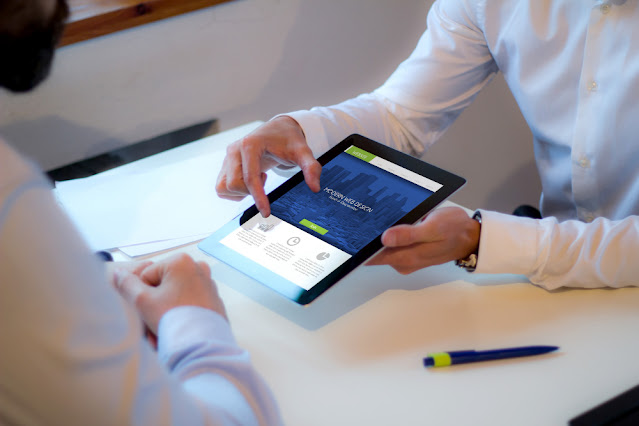
Four techniques to create an understated web design
The process of
doing or displaying more by showing less is referred to as minimalism. It is a widespread
modern creation practice employed in simplifying web and app interfaces by
removing the elements which are extra focused. With the frequently increasing
use of smartphones and tablets, the feature of minimalism is slowly gaining
attention. There are different ways by which the method of minimalism could be
implemented, such as navigation, transitions, colour experimentation, broken
composition or the blanket removal of all the elements. The pages or apps that use
minimalism look elegant and beautiful and efficiently communicate through the easy
navigation process. Therefore, a company should ask a web development company
providing eCommerce services to implement specific techniques of minimalism.
Some of them are mentioned below.
Recruiting a web
development team is excellent but focusing on other aspects of your website is
equally important. If your company is looking for special skill-set services
such as eCommerce portal
development services, visit Coweso on our home page.
Make the Use
of Whitespace or Negative Space
Whitespace/negative
space is the place between significant blocks in a composition. One of the crucial
elements of adopting minimalism is to use whitespace. Whitespace provides many
benefits. It transforms the user experience and attracts their attention to your
web page content and products. It also does the essential task of providing
balance to a created design. In addition, as you know about the space between
your portal's primary content blocks, you can utilise your website to captivate
your users and attract them so that they can browse and remain on the webpage
for a longer duration.
Make Sure to
Use Bright Colours on the Website
The bright
colours on a webpage make the mind happy and also look fabulous. However, it is
a complicated process to integrate such colours to achieve minimalism. A
colourful interface enchants & attracts the customer's attention while boldly
conveying the message simultaneously; too much shininess and lack of even a
small volume of sober colours can transform the page for the worse from
attractive to ugly. You should employ a few techniques to combat this problem. Try
to use bright colours after combining them with a more soothing, sober and stripped-down
palette. Make sure to add some typography in black & white, as this method
will make your item more tempting and attractive to users. Most importantly, avoid
the use of ultra-creative scripts, hideous transitions between blocks and complicated
animations. Hire a competent web development company in Brisbane, such
as Coweso, offering various services to perform the tasks.
Use Fonts on
the Website Creatively
The impressive
use of typography or scripts is another basic method for minimalism. Pretty and
clear fonts play a significant role as a part of eCommerce development &
are one of the top trends in content creation. The words can compensate for the
animation & photos while making the portal attractive If the website is not
using them on a large scale. A designer should ensure that the font is clear
and easily readable to catch the user's attention without compromising their
creativity. Another critical point is differentiating the content hierarchy by
using fonts. It means explaining to users which content is crucial by employing
font and assisting them in browsing the portal.
As most users
come through smartphones, another crucial point is to focus on mobile browsers
or apps while creating fonts. For example, you can use the 'Sans Sherif' font
style while designing a minimalist website, as it is crisp and easy to read for
both mobile and web portals. In addition, small fonts can get lost on the page
and affect the page's overall design. Therefore, ensure that small fonts are
used correctly on the webpage and ask your web development company in Sydney
to check the issue.
Apart from the titular service, a company requires various
other services. One of them is IT
consultancy, and Coweso is the leading provider of such services. Reach
out to us to gain more knowledge about our offerings.
Display
Navigation Buttons on the Website
One of the
topmost criteria to get a minimalistic effect is removing and discarding all
the excess features on the portal. However, it doesn't mean that the navigation
button should be affected in any way. Many web development companies recruit developers
who typically also remove many buttons on the website critical for a better consumer
experience and more effortless navigation to various pages. Therefore, make
sure that no instruments, links, or buttons important to users should be moved
or affected. The developer can edit the menu button and accommodate the remaining
navigation buttons into it.
Another usual practice is to use the organisation
logo as the homepage button. If we think of a website apart from minimalist
designs, the main focus of a website is to attract customers. They should know
the button positions and check whether they're clickable or not. Always keep
details on what your website
development company is doing and ask for frequent reports.


Comments
Post a Comment